Ceden Editorial
An editorial identity system built on typographic weight and quiet contrast.
- Client
- Ceden Magazine
- Location
- Milan, Italy
- Duration
- 10 weeks
- Services
- Brand Identity, Editorial Design, Art Direction, Web Design
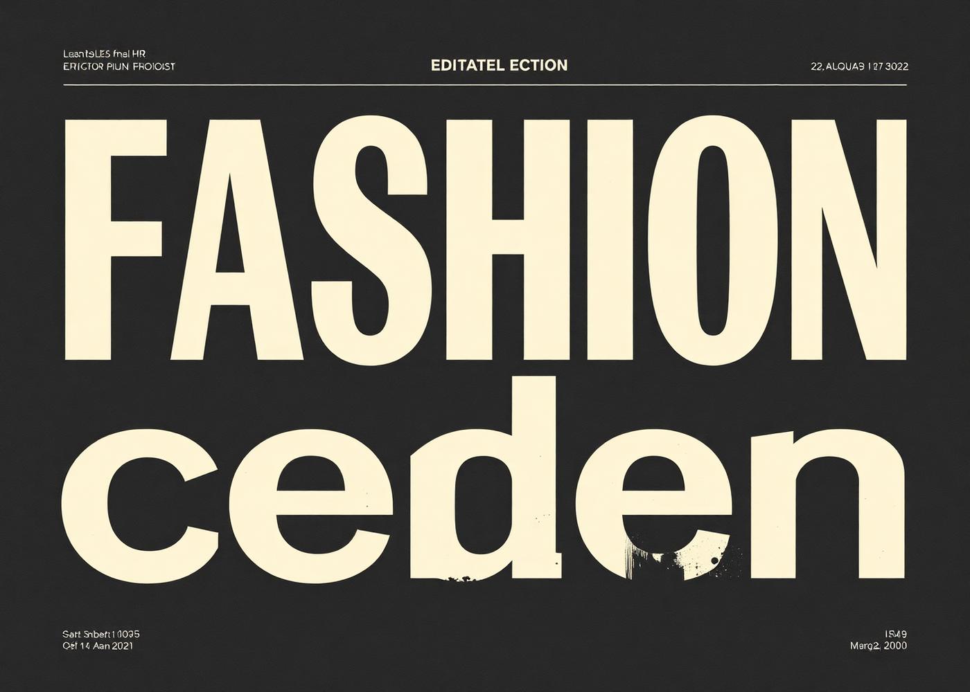
Ceden is a biannual print journal covering fashion, craft, and the people who make things by hand. We built the identity, the print grid, and the digital archive it lives in.
The founding editor wanted a magazine that felt like an object — something readers would keep on a shelf for a decade. That meant an identity that could hold its own next to the work it published, without ever competing with it.
One typeface, cut in two weights. A grid that breathes across six-column and twelve-column layouts. A masthead that shifts subtly with each issue's theme but never loses its center. The digital archive was built as a slow, deliberate reading experience — no infinite scroll, no recommendation algorithm.
Ceden's first issue sold out in three weeks. The magazine is now stocked in 60 independent bookstores across Europe and Asia and has become a reference point for a generation of editorial designers.
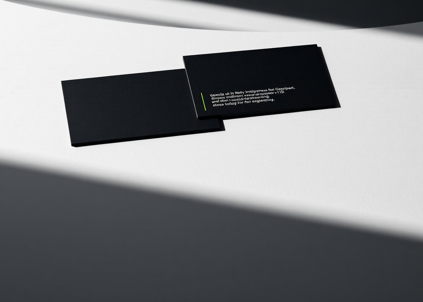
Selected artifacts.


The work, measured.
Issue one sell-out
Bookstore distribution
Print run growth
Editorial awards
“Goli understood immediately that Ceden had to feel like a book, not a magazine. That single instinct shaped everything.”